


Research
Dick Bruna was born in Utrecht on August 23, 1927. His great-grandfather founded the great Dutch publishing house A.W Bruna & Son in 1868. Since he regularly met authors and designers, he gained an interest for design. Bruna’s father wanted him to be a publisher but Bruna wanted to draw instead. When he moved to Hilversum he could not get use to the new school so he decided to leave. His dad allowed him to leave but he would have to join his business so instead of school he went to different internships. However, he really detested the commercial business so he tried to convince his family that he did not want to continue that path. Surprisingly, they allowed him to take courses at the State Academy in Amsterdam but when he married Irene de Jongh, his father demanded that Bruna get a steady job. Bruna ended up working at A.W Bruna & Son again. When the company decided to create a new book series, he was allowed to try designing their book covers. This became some of his earlier creations. The first time he created the character Miffy was to be a story for is son, Sierk. Now it is a very popular and well-known bunny character.
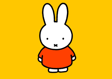
The images Bruna has created before and after Miffy fits his personality. He is known to be a perfectionist, which makes sense because the images he created look perfect in a sense. The edges of the paper cut out images for the book covers had clean, even edges. The colors are solid and vivid, with little to no shadows. The drawings after the creation of Miffy had smooth lines that form simple geometric shapes. He still continues to use vivid solid colors in his drawings. His creations are very graphic, simple, and sometimes very cute.
Bruna works do not relate to my idea but it does relate to what I want to try to do for the animation. I want to create a simple character but try to make the movement more fluid and consistent. In a way, I want to create a very smooth animation that is hand drawn. Also by making a simple character it will help me focus on making the movements consistent. Bruna’s images help the viewers focus on the important points of the image. The book covers he has made focuses on what the book is about. The simplicity of his designs lets the readers focus on the character and what the character is doing.
I like his work because it is graphic and brightly colored. The character Miffy is cute but has some flaws, which the artist even has mentioned. Since the character design of Miffy is so simple, it is hard to make her express different emotions. He has done well with what he can do to express Miffy’s emotion, but I think it’s a problem if a character can’t really express a lot of emotions. It can make a character look emotionless and slightly creepy.
Icon of Graphics: Dick Bruna
--------------------------------
Simon Todfield is a British animator for the animation called Simon’s Cat. He grew in Leighton Buzzard, which is a town in Bedfordshire, England. His first earliest drawings were usually drawings of all types of birds. That soon evolved into making drawing of wild life with a cartoony style. He drew a lot when he was growing up. Some point between his art school and University years he started to animate. He animated adverts for TV for thirteen years before he started to draw animations on his computer. His first animation was an animation of one of his cats trying to get his attention. This has opened a door for him to create the small animation series called Simon’s Cat. All of the animations are hand drawn in Adobe flash. Beside animation, he has also illustrated books about the main cat character and his other animal friends. Simon still creates these small animations with a small group and he still continues to hand draw each frame.
Simon’s animations are black and white, and very cartoony. The black lines on a white background make the animation feel very clean and simple. The simplicity of the animation makes it really easy for the viewers to focus on the story and the characters. All his animations are relatable to people who owns a cat but it has a very funny and exaggerated twist in the story, such as the cat pulling at his owner’s ear or knowing how to use a remote control. The animation does have sound but it’s usually sounds you expect to hear. The cat and his animal friends talks like animals, and the human in the animation does not really talk that often, or he makes very garbled, muffled sounds.
I want to be able to make a smooth flowing animation similar to his. However, Simon’s animation does take a long time to make even with the small team. His animations are not really communicating anything important. He is trying to create stories that people with cats can relate to but still make it entertaining. The animation is not just for cat people but also for anyone to enjoy.
I think Simon’s animations are great for all ages and relatable for some. He took something that is part of his life and created a wonderful animation for all to enjoy. I think the flow of the animation is amazing for a hand drawn animation and I love the character’s personality.
Simon's Cat Youtube Channel
Simon's Cat Website
--------------------------------
Rafaël Rozendaal was born in Amsterdam at 1980. He currently lives and works in New York. He is a visual artist who uses the Internet as his blank canvas. He had exhibits all over the world in galleries and museums, and had made installations with projections.
Rozendaal uses brightly colored graphics, simple movements, and gestures to create interactive websites for people to visit. Even though he sells the websites domain, he still makes them public to the viewers worldwide. Most of Rozendaal’s websites show no instructions or summaries of what the website is suppose to do, which encourages the viewers to play around with the website to figure out the function. One website that I thought was fun to play with is called “looking at something . com”. This website is about thunderstorms and rain. As you move the mouse up and down the screen, you control the intensity of the storm. If the mouse is at the bottom of the screen, the screen becomes a thunderstorm. As you move the mouse up towards the top of the screen, the scene changes from a dark thunderstorm into a light blue sky with birds singing in the background. Depending on where the mouse is on the screen, the viewer controls the intensity of the storm. This is fun to play with and is actually a really good website for people who like to listen to the rain. It is easy to learn how the website works because it involves the viewer to move the mouse around to see how to control the website.
My goal for this project is to make a website that engages the viewers. I want to have the viewers to explore the world I created, and find out how things work by clicking or moving the mouse around. Like his website that imitated rain, I want to make it learnable enough so the viewers know what is going on with a certain interactive part of the website. Rozendaal makes his websites easy to learn without making the mechanic and design complex, and forces the user to really look at the work. Even though my idea is going to involve more interactive elements than just one main element, I want it to still be easy to learn and make the viewers explore the website.
I think Rozendaal does a great job making his websites entertaining and rmake the viewer become more hands on. The only complaint I have with the website called Looking at something is that he could have the thunderstorm more accurate. I think there should have been a bit more space between the flash of light and the sound of thunder. In a real thunderstorm, the sound of thunder comes after the flash of light. Other than that one small comment, I think his simple graphic art style he has made for the website fits the interaction aspect. If the art was more detailed or realistic it might have been hard to keep the images consistent as the images move or change.
Rafaël Rozendaal's Website
Rhizome: Rafaël Rozendaal
Artsy: Rafaël Rozendaal
--------------------------------
Luckydrop is a “pen name” of a graphic designer and website designer. There is not a lot of information on this artist because I don’t know his name. It did have his email address in his website but I don’t know if his name is his email address too.
Luckydrop has two really interesting websites that caught my interest. The two websites are his own website and a collaboration website with three other artist. In his website, it is all about chance. The first thing you encounter in his website is a digital version of a scratch off. The scratch off element will give you some random “prize” if you get a pair of the same symbol. The “prizes” are videos, images, gifs and websites that as little to do with him. You have a chance of seeing some of his work and a very small chance to see his profile. This is a very inconvenient way to have new viewers see ones work for the first time but it does get the viewers to interact. Luckily, Luckydrop has put a link to his works in the rules of the scratch off game for those who just want to see his works. The other website is a collaboration website for Halloween. The website is just for fun and to create a Halloween theme background that the viewer can download. The homepage is divided in have with the top half being one huge black button that says “trick” and the bottom being a huge orange button that says “treat”. The black “trick” button will randomly take the viewer to a different page or website such as Facebook, Twitter or a page that they made themselves. The “treat” button will take the user to a different page where they can make Halloween themed patterns. These two different website gives the viewers a chance to play around with the website and get absorbed into the activties. The appearance of the website also helps keep the users interested. The websites had a simple layout that was not cluttered with other buttons of links. If also was easy to learn how to use the website by play around with the page or reading the instructions that appears for the viewer.
I want my “choose your own adventure” website to encourage viewers to interact with the environment and get absorbed into the activities. I thought Luckydrop did a good job with making beautiful websites that is simple and entertaining. For my “choose your own adventure”, I want it to look good and have some entertaining elements in the website such as buttons that changes appearance of the scene, or make the characters move. I want these buttons to be hidden or blend in with the scene so that the view will have to look around the website and start clicking around.
Luckydrop’s websites are very colorful, which makes it eye catching and playful. However, the pages that talk about his works are a little too busy and kind of hard to find the links to the other pages. It would be nice if he could have made the links standout more. It would also have been nice if the image example of his work and images from his blog looked less blurry and a little too big. The viewers cannot see the whole picture on the screen without moving the scroll bar around. If he made the images a little bit smaller, the images would look less blurry, and can be seen on the screen without scrolling up and down.
Luckydrip's Website
Trick or Treat
Karolina Sobecka
Karolina Sobecka works with animation, design, interactivity, computer games and other media. She endgames the public space, and explores the way we interact with the world. She has a BFA from the School of Art Institute of Chicago and a MFA from Calarts in Experimental Animation/Integrated Media. Karolina also has received awards from NYFA, Creative Capital, Princess Grace Foundation, Rhizome and many more.
Karolina has two installations where the viewers interact with the virtual figures. One installation called It’s You, which is an interactive storefront-window projection that explores the mechanisms of public behavior, and the lines between reality and constructed social actions. In this interactive projection, there are human figures crowding around something while their backs are facing the viewers. The human figures are simple white computer animated figures, which are formed with small geometric shapes. They look slightly realistic because each human figure has a unique appearance but they lack colors and a detailed face. If the installation detects a viewer at the storefront, the human figures would occasionally look over their shoulders, as if they were looking at the viewer. After a certain period of time, the human figures would move away from the viewer’s sight path to let them see what they were looking at. If the viewer stays there long enough, the human figures will turn around and face the viewers like they were street performers. If the viewers does anything as the virtual people looked at them, they will sometimes clap or “take pictures” of the viewers.
Perfect Creatures is another installation that interacts with the viewers. This project does not use a projection, but it uses a mirror with an animal head that appears when the viewer is in front of it. The animal head varies and they have the same computer animated appearance as the humans in It’s You. The animal will mimic the viewer’s movement and expression, but will occasionally make it’s own expression. This project is based on “mirror neurons”, which is when someone watches someone else performs an action, and mirrors the action. This connects to how predators and pray sometimes think like the hunter or the hunted to figure out their behaviors.
For the final project, I want to make an interactive projection that will do something when people walk past the projection. The idea I have is to create a living statue character that will stay still and look like a normal statue, until someone walk past it. When someone walk by the statue, the statue will open its eyes and do something random. With both of the projects she made, she was able to get the viewers to interact with the installation long enough to start thinking about the message it is conveying, or to understand a concept. I want to be able to make a projection that will make the viewers stay and interact with the living statue. I do not think the idea I have will try to convey some message, but I want to see what the viewers will do with the statue.
It’s You and Perfect Creatures’ style makes them obviously fake and synthesize, which makes interacting with them eerie. The reason it makes me feel this way is because the depth, and details makes the figures look like objects you could reach in and touch. I think the fact that there are a bit eerie make the viewers think about the meaning. As I watch the examples of It’s You, I got the message right away because of how the figures moved and when they start watching you. When they start to look at you it makes me feel uncomfortable seeing all the white figures looking at me. I think eerie look of the figure enhance the feeling of uneasiness. I do not think that this was intentional but I kind of think it makes a viewer think a bit more. For the Perfect Creature, appearance of the animals looks less eerie but more entertaining. It’s more eerie if the figures looked like humans but when they look like animals it looks like a game. The fact that it feels like a video games makes the viewer more interested in the interactions, and starts to play around with the head. This helps also convey the idea of “mirror neurons” by encouraging the viewers to play with the animal head.
Karolina Sobecka's Website
--------------------------------
Chris O’Shea
Chris O’Shea is a British artist and designer, who use technology to create new approaches that explore play, human behavior, and engagement. His mission as an artist and designer is to make installations, digital toys, and play spaces that are fun and wonderful. His works always aim to be immersive, participatory, encourage people to explore their imagination, encourage creativity, increase confidence in self expression, allows people to collaborate, and try to involve all sorts of body movement.
In the two installations I looked at closely, he successfully apply his values into his works. Woodland Wiggle is an installation in the Royal London Hospital. It’s an interactive game on a giant television that allows children to enter a storybook illustrated world that lets them do different effects. Children can paint, play music and trigger weather effects with animated animal characters across a number of woodland scenes. These installations will stay at the hospital permanently to help children by giving them the healing powers of art and play. So in this installation children are suppose to move around to create these visual effects. The installation keeps the children entertained with the different sounds and effects. Also the large screen makes it easy for the children to immerse into the illustrated world.
Another fun installation Chris has made is called Hand from Above. The installation has traveled around different places in the world. It is a giant screen above a busy area, which shows live footage of the area. The screen will randomly choose one person on the live footage, and a hand will appear and manipulate the person on the screen. It is another example of a successful piece that is fun for everyone and interactive. In the video of the installation, it shows examples of people of all age and gender laughing and playing along with the giant hand. Also the size of the screen and the loud sounds make the pedestrians notice the installation, and possibly start playing along with the hand and everyone else.
For this projection project, I want to be able to make an interactive projection that is fun and grabs the audience attention. Like Chris’s installations, I would like to aim for an interactive projection that is fun and makes people laugh. I think it would be a good idea to create an entertaining projection that will give the students a good laugh during the stress of finals. In the Woodland Wiggle, Chris made the installation for the children to laugh and have fun, which can help them by making them happier and active. I want to be able to create an environment where the students can laugh and act a little silly.
Chris’s installations are great for children because of the silly activities and easy controls. The installation can also be enjoyed by older people and does not lean towards a specific gender. I think the activities people can do with these installation are things he aims for in his works. His installation is fun, it makes people move, it encourage them to be creative and it makes them collaborate. Chris’s installation most likely will not be appealing to very serious adults since it may seem pointless and has no complex meaning. However, since his target audience is mostly children, this is not a huge issue.
Chris O'Shea's Website
--------------------------------