Kristin Seymour
Advanced Sculpture, 2014
Project 2: Place
Kristin Seymour
Intention Statement: Process
Recently my art works have revolved around one multi-step process of creating graphic designs from natural textures using photography and digital tools. My normal practice is to keep these designs removed from their original source and to present them in a gallery or other art space. My intentions for this project were to place my designs back into their natural environment so that viewers could see the true source of the content. I wanted people to experience the design while in its original location.
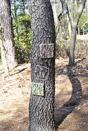
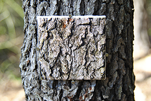
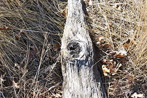
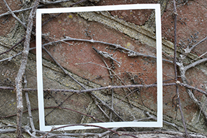
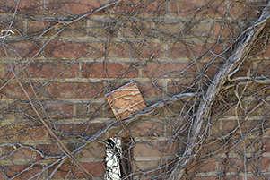
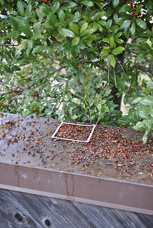
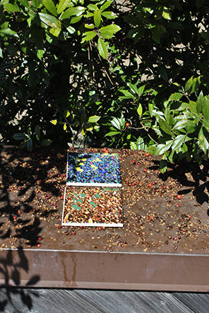
I engaged this project’s focus by relying heavily on location. I not only took on-location photographs, but I replaced the artwork exactly back into the place where I took the photograph. I did not imagine and draw the designs I created; I used direct photographs of the textures in nature. I photographed tree bark, moss, driftwood, flowers, berries and vines on a brick wall. All the images were taken outside in nature and off the beaten path. This was so that viewers had to already be immersed in nature to experience the work. If I had chosen to place them in high traffic areas the quality of using natural subject matter would have not been as relevant. The act of traveling to a place usually not seen also adds to the quality of place-oriented artworks. The immersion in the environment adds to the piece. The choice in color is also important to the piece and to the place. For each type of location I made multiple different color schemes. I created naturally colored designs, foliage and brick colored designs, and non-natural (bright colored) designs. The non-natural options stood out more and were seen easier by the viewer. These designs received more attention but also seemed to make viewers analyze the work more than the naturally colored counter parts. Each design was composed of six colors and was an abstraction that brought out the forms and lines within the natural textures.
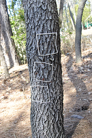
Much like Andy Goldsworthy’s work, I did not go into the locations with a pre-determined artwork in mind. He would enter a space and then create work based on the surrounding natural objects and phenomena. As I entered the spaces, I did not know what textures I would photograph before visiting the location. I chose to photograph the bark and drift wood at Elms Beach Park because that is what natural objects are the most prevalent. In this location I chose to mount down the tiles because I did not want them to disappear. I wanted them to last for many visitors to come. I also chose locations off of the paved path or beach. All the chosen locations were more secluded. I visited the park and stapled white paper frames to the trees and left them behind for over a week. When I returned they were all still in place, although a little battered. I purposefully left them there hoping that people would notice the empty frame and wonder what it was for or what it was predicting would come. I now hope that those same people will see the tiles in the frames place.
On campus I chose two locations that melded infrastructure and nature. Both places had intentional nature as well as unintentional natural invaders such as weeds, moss, vines and grass protruding through bricks. The designs for these locations were less naturally colored as a reference to the developed location. I also chose not to mount down these tiles because I wanted to see how and if people would interact with them. When I revisited my placed tiles, they had been moved and displaced, meaning that people had seen my tiles and felt the need to move them.
I think mostly my work was effective in achieving the goals I set for it. Some people saw the tiles and others did not. When I took the class into the courtyards where I had placed some of the tiles, I had to point out some of them and others I did not. Also, an unknown person moved one tile to a place on the tree as if they thought it had fallen to the ground and not placed there. The placement of the tiles as far as height also played a role in the interpretation. The works on the ground seems like they had fallen, where as the ones up off the ground were read as more intentionally placed. In reference to the pieces on campus, the tile is an industrial material displaying a natural texture. This references the melding of nature and industry in the atmosphere of campus. In some of the designs viewers could clearly see the lines and forms connecting to the lines and forms surrounding the tile. Seeing this connection emphasized the goal. In the end I effectively addressed the prompt of place because I made designs from photographs taken of a texture and then placed that design exactly back to its origin.
Back to Index
This page was last updated:
April 10, 2014 7:29 PM