Artist: Brambilla, Marco
Marco Bambilla has produced large scale looping videos of popular and found imagery since 1999. Most of his works are considered to be visually chaotic, and provides viewers with sensory overload. His wonderful video collages have been placed in exhibitions worldwide, and a single has received millions of views from Youtuber’s. He has written a book, titled Transit, which was published in 2000. Marco Brambilla is such a diversified artist that he willingly designed Kanye West “music” video, Power. He manages to continue creating video collages and advertise them to the world by living a double life traveling back and forth from New York to Los Angeles.
Marco Brambilla has his very own website- http://marcobrambilla.com/index.html. Underneath of the tab Work there are three of his videos that I find disturbing, but that are also amazing in design, meaning, and content: Evolution (2010), Flashback (2010), and Civilization (2008) are all compelling works. Beside each displayed artwork there is a description of the artist concept. Flashback is a video canvas of gathered imagery that showcases a collection of conscious moments that film has captured. His concept was to display human emotion through a conscious state. It is not known what type of conscious state the author intended, but from the photos I feel the pain of the subject for having to experience, and or recall what has occurred. The imagery chosen give me the impression that something horrific has happened due to the images of the road, trees, and a subject running. An individual’s consciousness is heightened and so too are there emotions in recalling a horrific memory, such as an accident. Maybe this consciousness and expelled emotions the artist is trying to portray, are not reacting or occurring from a horrific accident. Because these images are quickly repeated, and are grey in color, accept for the road image, this makes the artwork disturbing.
Civilization illustrates eternal punishment that disintegrates from this concept as the video moves up from the gates of hell to heaven. His concept is gotten immediately because upon first view, I thought of an industrialized city. Every layer except for heaven had people working, and I thought of the people who constantly work in the conditions this video portrayed (labor intensive). The video world seemed industrial-like, which also made since because industrialization is what prompted a working society. Also, from this video, I concluded that work continues for anyone, and that the in between in just like hell.
I can relate to Marco Brambilla as an artist because his artworks are dark, funny, but most importantly chaotic with imagery. The video Civilization- http://www.youtube.com/watch?v=IT1ZkFfZNWs relates to my artwork because he is revealing layers of civilization from earth to sky. My video too has layers; within the multiple television shows that I have merged together, individuals fly and then hit earth. Layers exist within the multiple shows that I have revealed, because the whole piece slowly disintegrates to no noise. Both of our works are disturbing because his videos are visual overloads due to the many colors, overlap of images, and a wide variety of content. My video project is painful to look at because bones are heard and seen being destroyed; and these images are repeated. The reaction the viewer has to horrific visuals is psychological. The viewer may feel connected to the pain of the subject portrayed- and may react with a cringe. Another similarity is that our work is fixated on a particular part of civilization: we both portray mankind, and our emotions. We also borrow images/ television shows from popular culture.
Marco Brambilla’s artwork is magnificent, especially his recent works. I can praise his work forever. His work is impressive because of the time each project required. The fact that he collaborated with Kanye West to produce the video Power was unbelievable. With his past works I was impressed that he willingly engaged in a different art element such as the music industry.
Dev Harlan lives and works in New York as a light designer, and has had this interest since 2005, but has also held many other interests like producing short film animations. Harlan joins effervescent lights and sculpture to create an attention grabbing projection light design show. He uses geometric light designs to wrap around his self-made geometric sculptures. Using video projection mapping techniques, Harlan controls and shapes the projected image into precision alignment with his sculptural forms (http://www.devharlan.com/doku.php/astralflighthangar). He then turns his light designs into video, and the rhythm of each work becomes more apparent (http://vimeo.com/devharlan/parmenides). His work has occupied nearly seven exhibitions.
Dev Harlan and I do not share commonalities in artistic ideas or style. But, I have chosen Dev Harlan to research because his light designs are mesmerizing. The usage of eccentric colors, the creation of rhythm, and technique produces a well rounded work of art. The fact that he is also a sculptor who uses his models to shape his light designs is inspirational because he gives me plenty of ideas as to how sculpture can be intertwined with other mediums.
His show, “The Astral Flight Hanger,” was recently made in 2011 and I must agree that this specific artwork of his which he made into a video is captivating. How the light sequences are broken up with settle transitions allow its audience to sit in its presence and appreciate this work. These settle light sequences are relaxing and are nothing like the blasts of light that was incorporated into my last project. Harlan light design is not disturbing or aggressive in any since; the lights have almost a calm manner to them and the audience mood is in turn switched to have a relaxed demeanor. His work resembles the Fourth of July fireworks show. The fireworks bring me to a calm state of mind because when I view the colors and the flutters of smoke afterwards, child hood memories arise. This is what Harlan’s work does for me. His designs are pleasing and initiate curiosity in the viewer as to the artist process. Harlan’s technique for producing designs that will accentuate, and correctly mesh well with sculpture is brilliant.
Harlan is influenced by the works of Bridget Riley, Victor Vasarely, and Richard Anuszkiewicz- but Harlan said he is migrating towards the three dimensional instead of the two dimensional. All of these artists who have inspired him are geometric painters. All three create paintings that have motion and space through the type of stroke made. False space within reality is achieved with this painting technique. Each use vibrant colors and shape to transform the two dimensional plain. However, Harlan has gone beyond the two dimensional with the help of his three dimensional sculpture(s). I have only seen one sculpture of Harlan’s to play a part in his work, which is the spiked geometric sphere. This sphere and its light design is seen publicly on the streets, which unknowingly transforms the space and rhythm of the object. The show is not any more private once on the street, and its meaning is seen differently by passer bys. His work is fluid both on the streets and in a gallery setting, and he has succeeded in creating geometric forms from light and sculpture into a three dimensional artwork .
Links for Dev Harlan
http://www.devharlan.com/doku.php - website
www.thisispaper.co/Dev-Harlan-Promenides-I
Gerry Hofstetter is a Switzerland citizen and still resides there where he produces large-scale light art designs. He has had many managerial positions in his lifetime, but marketing and light design has stuck with him. Hofstetter owns his own marketing company (Hofstetter Marketing) since 1995 and has combined his marketing skills with his interest for art design in 2003, which he still continues to do for his clients. For his clients he transforms old buildings, monuments, and landscapes. And with every request, Hofstetter produces light designs with a message. His messages are most often centered on environmental friendliness, and it is at ceremonies, festivals, and events where he is able to spread his concerns, or beliefs, but still manage to keep the client happy, and intrigued. A fun fact about him is that he was also a gymnastic champion at one point in his life, he was even was in the military.
I strongly believe that his military background is what makes him a bold artist. One recent request from a client was for him to create a memorial celebration for the 100th Aniversary of the Titanics tragic accident. He decided to project a replica of the boat onto different icebergs. Each image of the boat was different in its position on each iceberg. Some of the images projected was said to be shocking to the public because of how it was positioned on the iceberg. The crashing/sinking moment of the liner was recreated. I am not sure what the artist intentions were, but this was his way of celebrating the Titanic’s horrific fall. Another environmental friendly projection was of a polar bear on the south glaciers, but the message lies within what region the polar bear belong to- the north glaciers. Polar bears are of the north region and penguins of the south. Hofstetters design cleverly showed the affects of global warming. If global warming continued to occur, animals of different regions would collide due to habitat loss. So, it was said that every time he conjures up a light design, he keeps the environment in mind. He creates specific light designs to motivate the viewer to consider how the sustainability of the environment can become our number one priority.
Gerry Hofstetter’s light art expeditions are partly financed by sponsors, cultural partners and patrons. He receives commissions from government organisations, institutions, foundations, museums, companies and private individuals (http://hofstetter-marketing.com/download/Profile_Gerry_Hofstetter_en.pdf). His environmental pieces are so bizarre because opposites are matched and meshed with one another. Projecting a waterfall onto an iceberg is silly, but also exhilarating because of how the light hit the different compressed ice (the transparent type, black and white. The idea was silly because a glacier would not be able to withstand the water rush from any type of waterfall. The glacier would melt, then fall like dominoes. Hofstetter’s camel-heard is also non-since. The desert is projected onto a glacier and snow. This placement of this piece however compliments the overall projected image because the divots and jutting ice within the glacier creates heat waves.
His artistic ideas are similar to mine because for my projection project, I would love to create a context surrounding slavery and strong wild using less imagery as possible. His interest to keep the planet alive, and pollutant free is how I imagine the world some day. The only difference is that he acts out his concerns using his light art designs.
Links to follow Gerry Hofstetter work.
https://infocus.credit-suisse.com/app/article/index.cfm?fuseaction=OpenArticle&aoid=265902&coid=271508&lang=EN
http://www.dailymail.co.uk/news/article-2127116/Titanic-tribute-Light-artist-recreates-sinking-liner-projections-iceberg.html

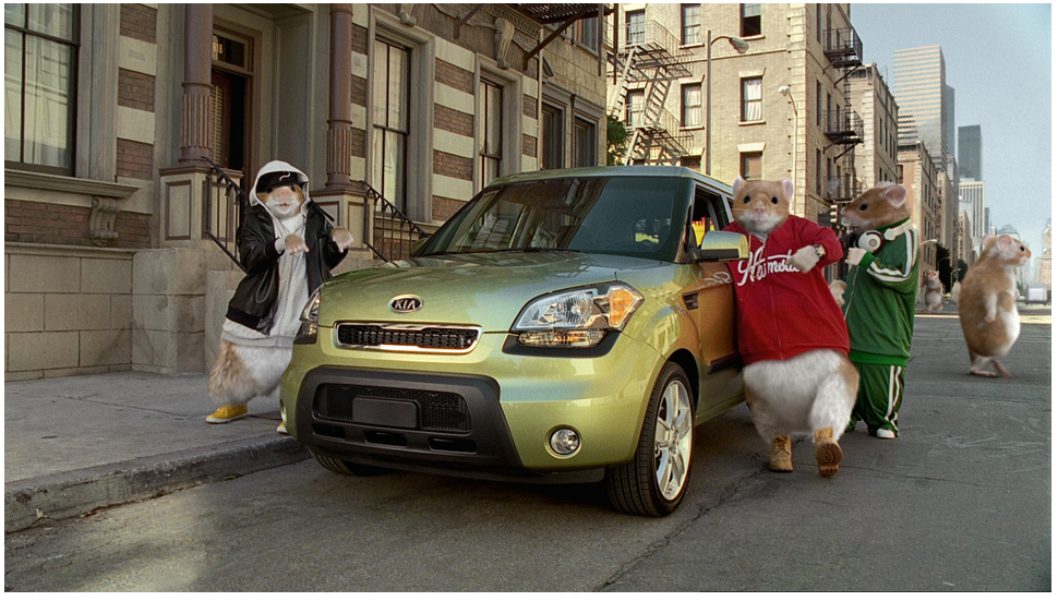
Kia Hamster commercials – David&Goliath
David&Goliath (artists of Kia Hamster commercial) is an advertising agency and their mission is to bring to their clientele, ads that will embody and sell the products that have been entrusted to them to market. This agency has done a magnificent job in getting the Kia Soul recognition internationally; not only is this New Kia model getting fame but the campaign ad is too. David&Goliath created a commercial ad that included dancing hip-hop hamsters. The intention of this commercial was to appeal to the younger consumers. These commercials have now gone viral on YouTube, Blogs, etc. David&Goliath ad was awarded, "Automotive Ad of the Year"; and the advertising industry chose the, “A new way to roll campaign (Kia Soul hamster commercials) to induct into the Madison Avenue Walk of Fame.
The first Kia commercial that featured the hip-hop dancing hamsters appeared in 2010- http://www.youtube.com/watch?v=HQ-CDE_r_wg . However, the Kia Soul commercial that really caught my attention was the one with the background music, “This or That,” by Black Sheep- http://www.squeegi.com/video.php?v=ef5499d8-96df-11e0-b7ab-0025901cfe10 . More of the city is scene in its raw state. The hamsters look out of place, but what integrates them back with the cityscape is the urban attire they wear. The clothing is real and not cartoony. The artist is not scared to give close-ups, and I find that intriguing/ brave. This video is keeping true to the nature of hamsters, which are a species of the rat family because they are seen riding toasters, in cardboard boxes, and driving in washing machines- all items in which they invade. For the project I will not try to hide the fact that statues are not real and pretend that they are not rigid because they are. With this mini movie I aim to embrace the chosen sculptures as sculpture.
The Kia hamster commercial relates to my ideas because bizarre objects such as the dancing hamsters are out of place in the reality world they are placed in. My project is quite similar seeing that I would like to use the sculptures that I have made to recreate the Wiz into a mini movie. Sculptures do not move and we do not see them as possessing human qualities such as personality and no feelings, so with this mini movie I would like to accomplish that. I would like the viewers to see sculpture in a different way, as persons that may have a story. With these commercials the artist is trying to sell a product in a new and innovative way that has not always been the way of David&Goliath advertising.
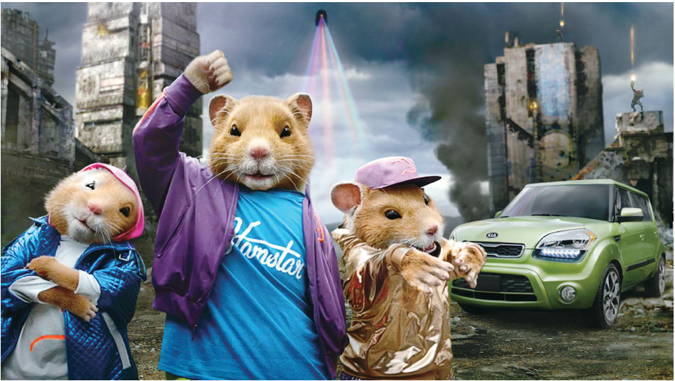
After each commercial, the hamsters become more integrated with their environment and the digital effects are more impressive. I do not lose the purpose of the commercial- the dancing hamsters and the context in which they dance, does not distract from the fact that the video is still an advertising ad.
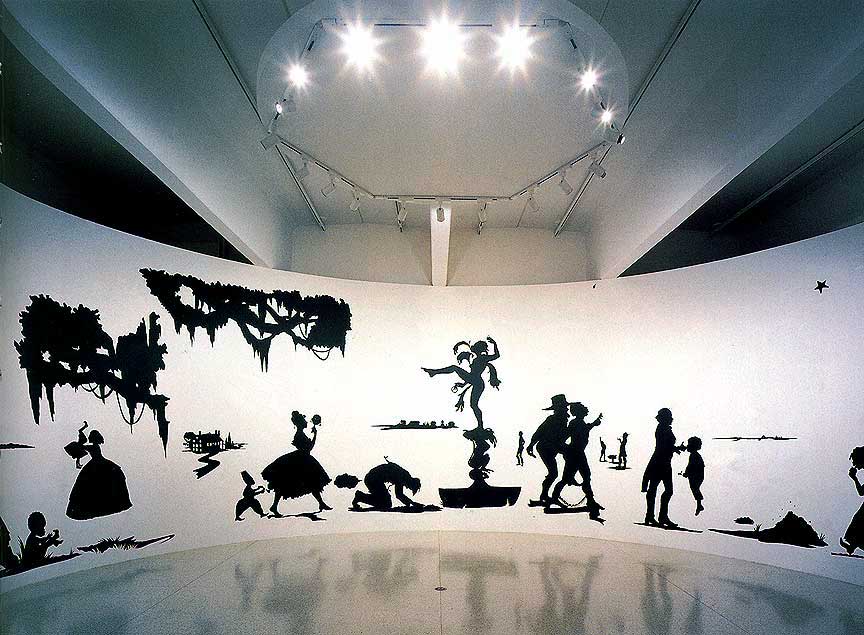
Kara Walker is a 43 year old artist/ Visual Arts professor at Columbia University who lives in New York. She is famous for her stunning but yet shocking black silhouette drawings that touch on the subject of race, history, power, and sexuality. These are her thoughts of the existing tensions within America- racial and gender tensions. To express her ideas she uses a range of medium such as paint- drawings- light projection, and text. To craft her interest she focused on painting and print making during her years at Atlanta College of Art, in 1991 she received her BFA and her MFA from the Rhode Island School of Design in 1994. Late in 1997 Walker became the youngest recipient of the prestigious John D. and Catherine T. MacArthur Foundation’s “genius” grant, which launched a public controversy around her work. And In 2002 she was chosen to represent the United States in the Sao Paulo Biennial in Brazil. Even though her work received controversy, she was still chosen as the artist to represent the United States. Her work has been exhibited nationally and internationally. She has had solo exhibitions from 1995-2006, and has been a part of group exhibitions from 1991-2006.
Kara Walker says “I was really searching for a format to sort of encapsulate, to simplify complicated things...And some of it spoke to me as: ‘it's a medium...historically, it's a craft...and it's very middle-class.” - http://learn.walkerart.org/karawalker/Main/Biography . This quote interested me because it made sense; Walker’s theme and thinking about the racial and gender issues within America is a problem the middle class/lower class heavily face more so then high class. Saying that her materials she uses represent this thought make her art more powerful, and shows that she is content with her message. The artwork titled “Slavery! Slavery! presenting a GRAND and LIFELIKE Panoramic Journey into Picturesque Southern Slavery or "Life at 'Ol' Virginny's Hole' (sketches from Plantation Life).” The simplicity of the figures can get hard to read sometimes especially when figures are overlapped or side by side of one another. Her images are brutal and they aggressively express her views on the issues within America. This installation represents slave life and oppressed people are visible.
Kara Walkers work relates to mine because the project that I intend to do reflects on identity- seeing that the story line will be similar. The sculptures that I have made will take the place of the characters in the Wiz. “I wish I had a brain, heart, courage,” are human components that create personality, and with personality, identity can be found. So, my sculptures as actors will be seeking identity as well, but with different wishes/desires.
Kara Walkers art is disturbing, and emotionally moving- and it is a continuous theme that I can relate to. Not because I am an African American, but because I have experienced racism first hand by the opposite race(s). Many say that it is difficult to be an artist of black culture without making the art about racism, and I guess they are right. The issue is still present so why hide it. There is a thin line between blaming the opposite race for racial discrimination and educating viewers on the matter. Either way, artists have the agency to express themselves in whatever way. Her art and technique is brilliant and always neat, clean, and simple, which I find pleasing. If her cut-outs were graphic, her installations would be challenging to look at judging by the graphicness of the simplified silhouette figures.